Sarah is one of the few that has been with the company for the longest time. Therefore using her as a persona would make the most impact when presenting to leadership. In the presentation, a user story will be written around her persona to narrate the journey of creating and delivering a course from her perspective.
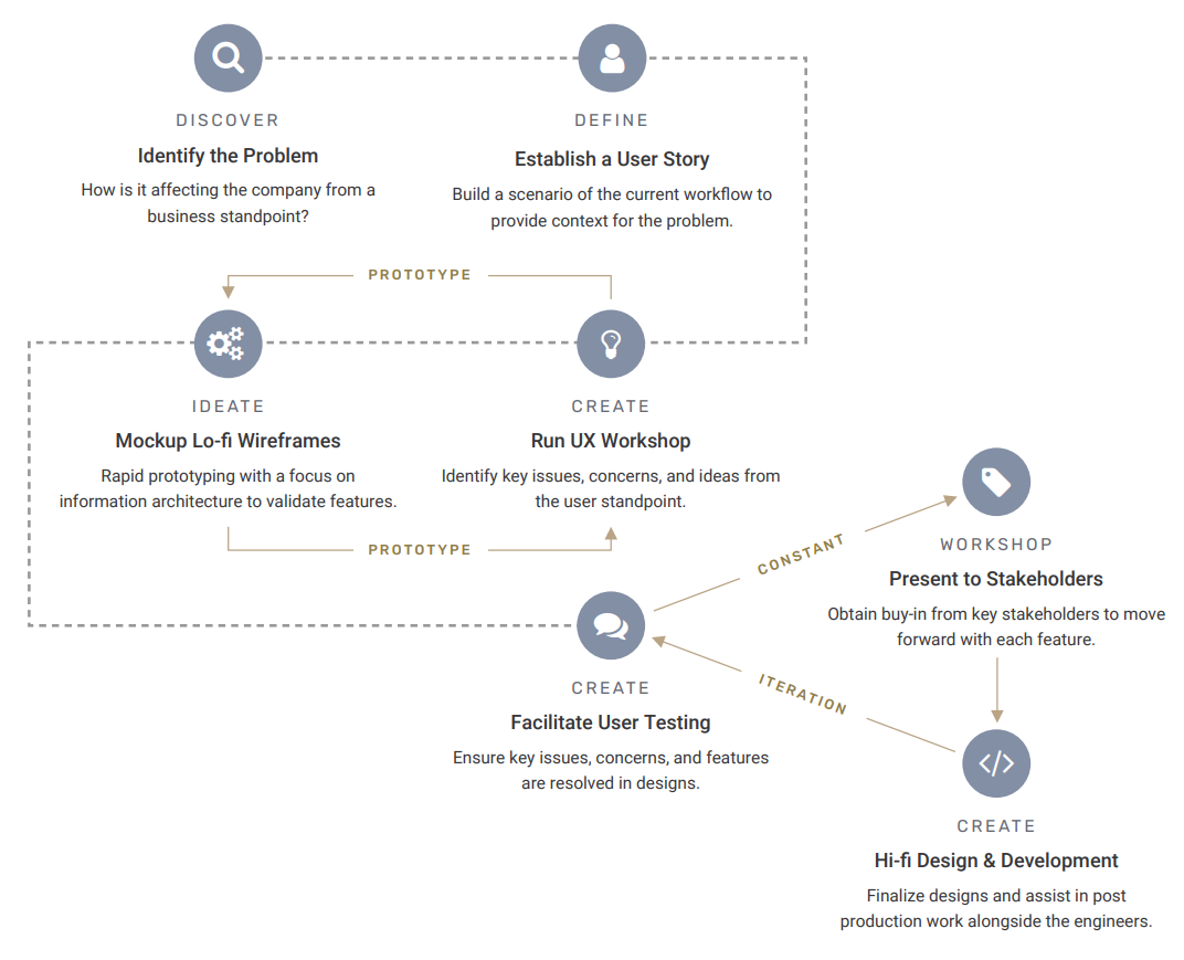
Initiated a workshop with users to start doing some Discovery and gain insight on whether all participants involved in delivering a course to our customer, actually know what our process is for designing, creating, and requesting for fixes. During this workshop, we had each user perform the following tasks:
Create a flow chart of what they think the current workflow is.
Fill out a survey expressing how they feel about the current workflow.
Only 50% of the users knew the process, and the Top 3 key phrases from identified in their pain points were: Not Efficient, Long Process, Too Many People Involved
Based on findings, started breaking down the journey with Aesthetic and Minimalist design in mind for customers that may have a simpler request. Then drilling down into containers and elements that can be customized, and showing what those customization option can be and will look like.
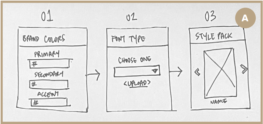
Simple 3-step journey with basic criteria to get started on building a course.
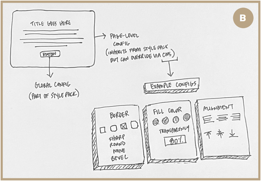
Identifying global-level, page-level, and object elements for possible configurations.
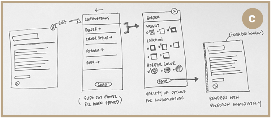
Example of available configurations and its interactive process.
After presenting the sketches to the Design Team, PO, and VP of Engineering — I had their support to move forward and skip the low-fidelity wireframes in favor to run user testing with a more flushed out visual approach. Since users were visual people, this was to ensure we have the most accurate feedback possible.
User Testing – Round 1
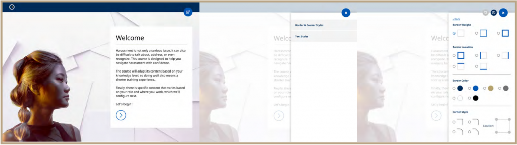
Introducing 2 levels – 1) list of containers available for editing 2) all the configurations available for customizing
User Testing Feedback: Need to have flexibility for a user to add images and icons – how can we allow users to configure around that.
User Testing – Round 2
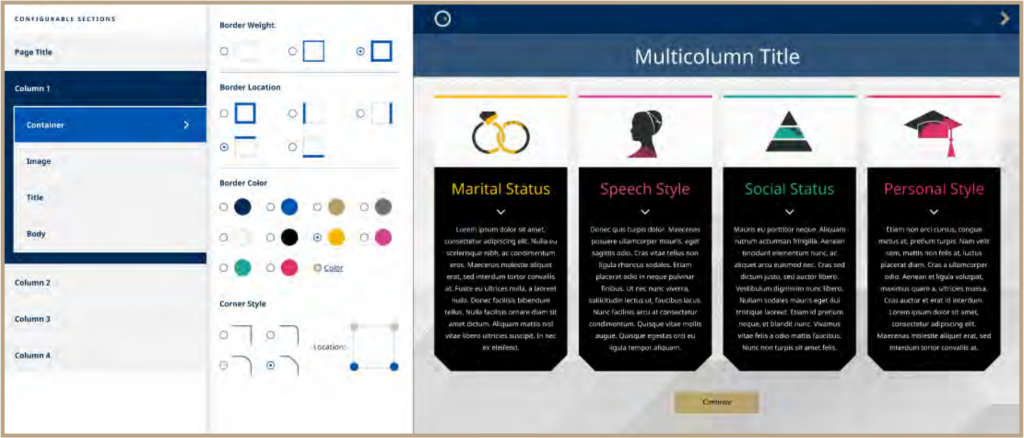
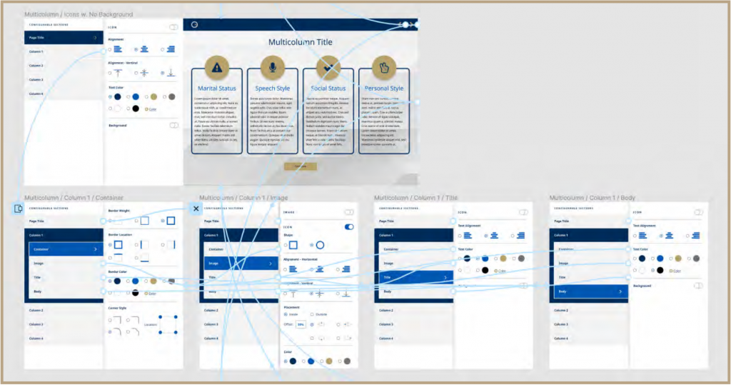
Moved slider to the left for a left-side navigation in favor of Consistency and Standards. Added an additional level to visualize how the level 1 navigation would like with multiple containers. Also addressed users concern for the ability to add and customize images and icons.
User Testing Feedback: Love the left rail – hierarchy is clear and can accommodate unlimited containers for extremely long pages.
After a few rounds of user testing, I went ahead and created a prototype to reach out to more users for testing (including engineers), to provide transparency, and to test for: ease of use, time saved on task, as well as additional ideas.
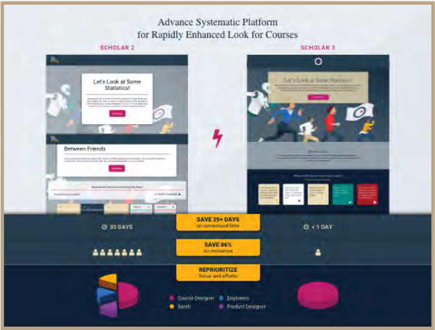
Upon receiving extraordinary amount positive feedback, it was time to create a pitch deck for the CEO to be onboard. In the pitch deck, I guided the CEO through the lens of Sarah’s current process for creating and delivering a course, followed by the newly proposed process.
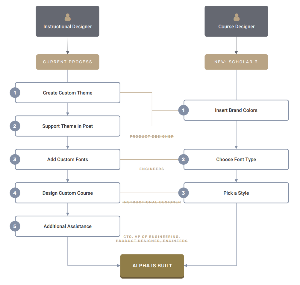
In addition, I also leveraged User Research data and statistics to really hit it home from a business standpoint. By creating a side-by-side comparison, I was able to highlight the resources we can save, the time for each resource we will save, and the speedy turnaround time — so we can refocus and reprioritize and our existing customers first, set ourselves up for success with new customers, as well as create a ton more courses!