Defining the user journey, and everything in between.
This was a very long session held between the CTO, 3 designers, and 2 key stakeholders from Standard Life. The session took over a week to accomplish, but necessary to establish all scenarios to assure that they will be reflected in the designs.
As we mulled through this journey, we also found ourselves constantly revisiting the project scope to ensure that we do not lose sight of the goal.
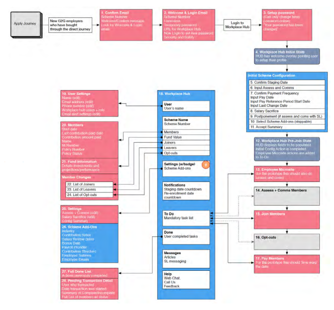
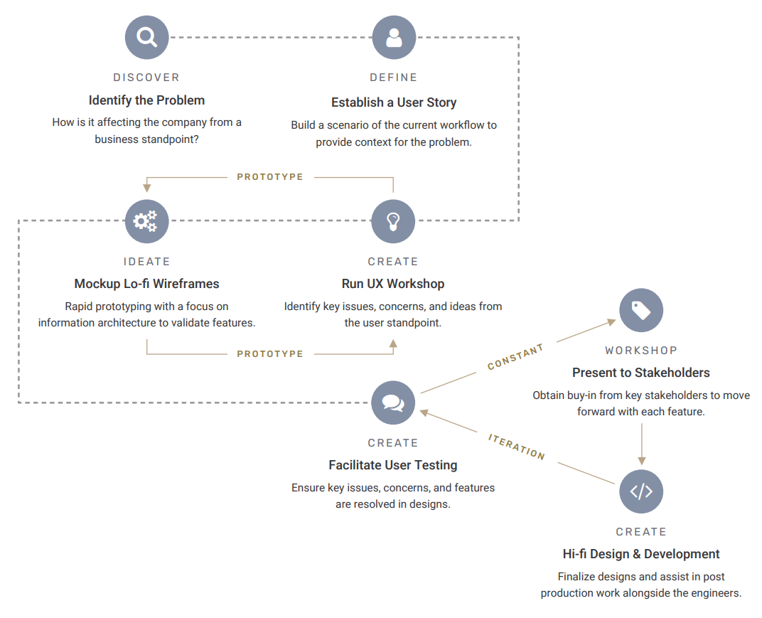
Working closely with the Head of Design and another designer, we spent about 2 weeks organizing the information in each step of the journey to understand the complexity as thoroughly as possible. When we got to a good place, we started sketching potential layouts of each element within a page, and then putting them together digitally in the next phase.
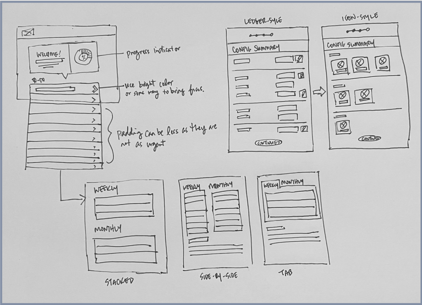
In preparations for user testing, we created a series of lo-fi wireframes and built out all the in between pages of one single journey. Here are some of those pages:
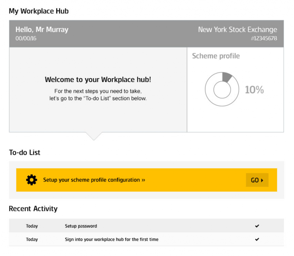
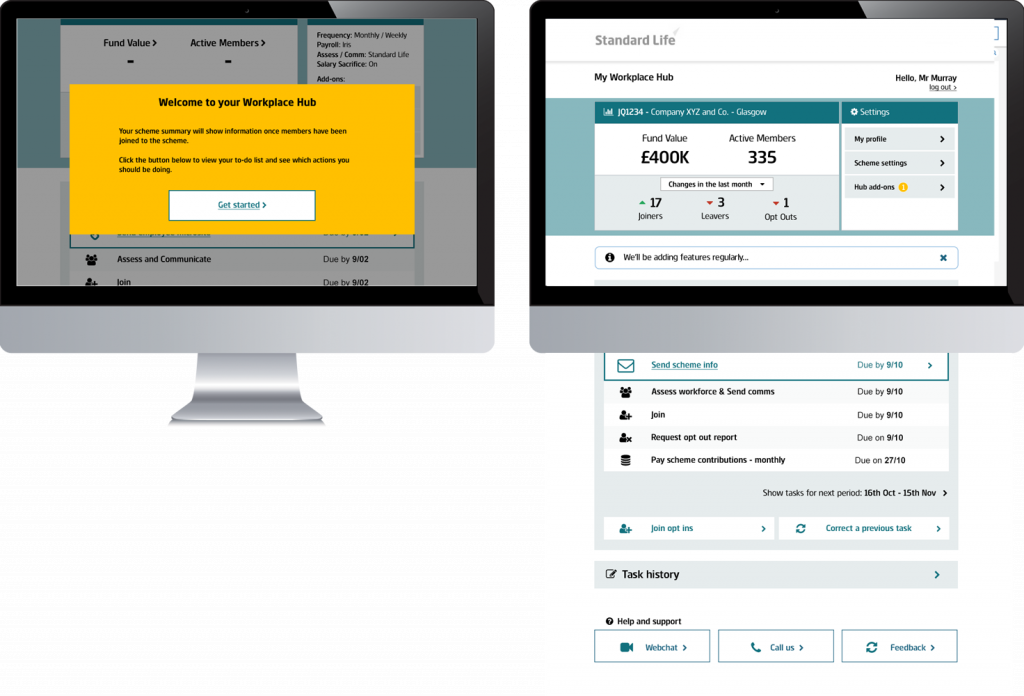
When an admin logs in, they are greeted with a progress bar and immediately guided to the highlighted area of tasks to-do.
Upon setting up a new account, an introduction is placed to set the expectations of this journey (displayed as bread crumbs above).
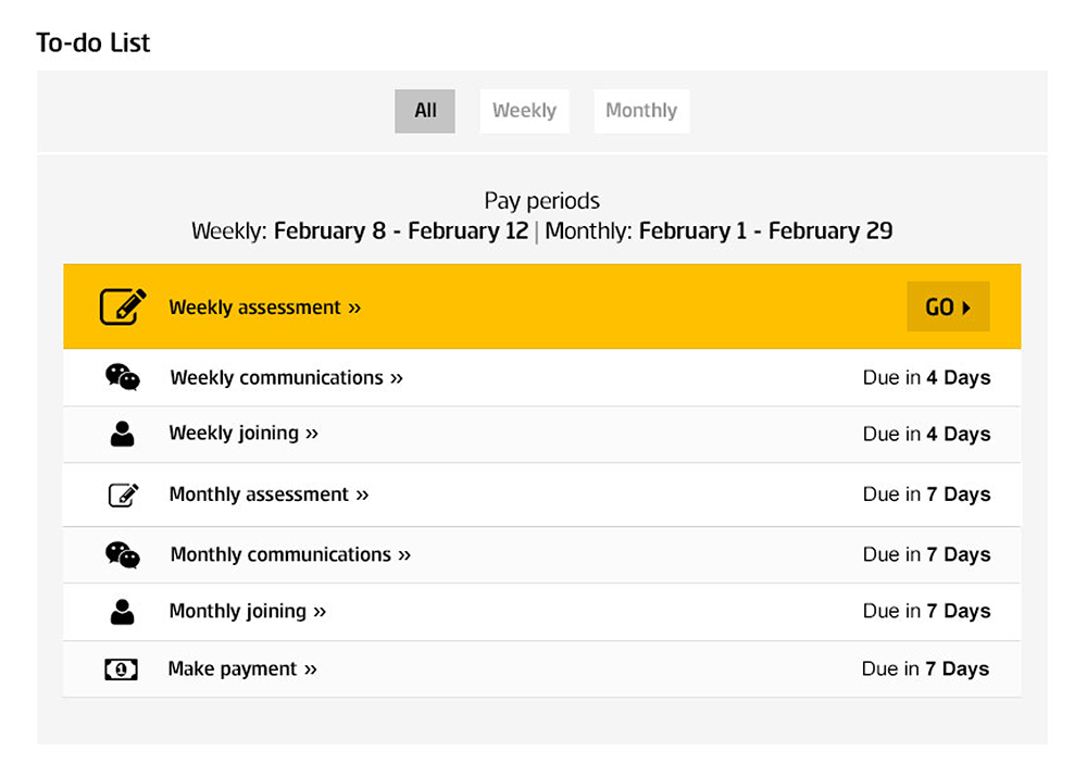
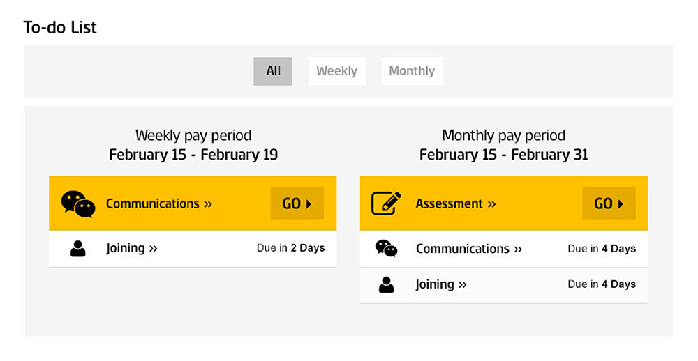
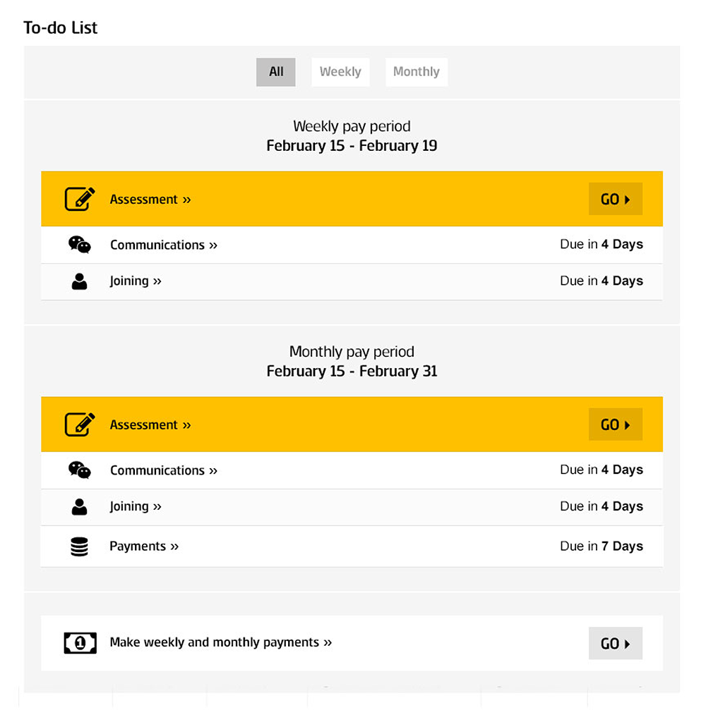
Once the data is in and configurations are set, tasks are auto generated and the admin will be presented with the whole list in their dashboard.
In the dashboard, there is a summary of all the data, as well as a list of populated tasks – showing the most urgent at the top of the list.
The whole journey was put through a 3rd party user testing company and when we got the results, it was mostly positive with some areas of surprises. Here are some high level findings:
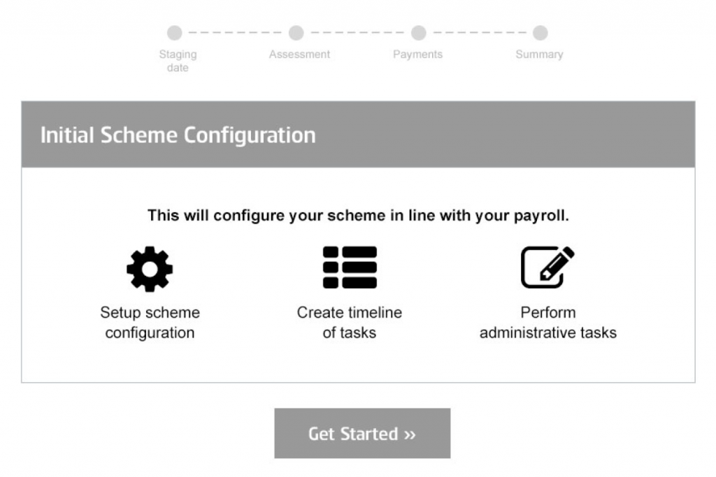
Configuration
We felt pretty strong about this page for setting context, but what the user testing revealed also had a very valid point so we ended up agreeing on the removal of this page!
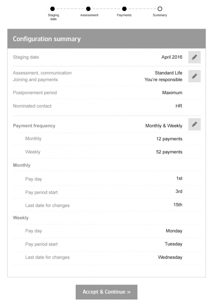
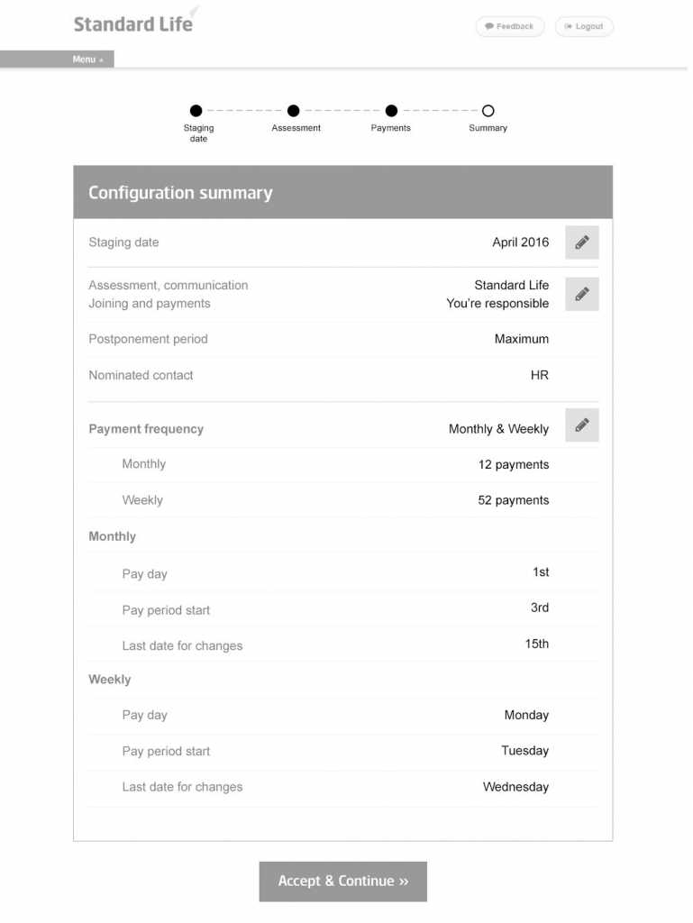
Summary
Version 1: Loved this with a suggestion to use it as a “landing page” instead of the journey above. Reason being is the user will only need to edit what is necessary, but stresses that clicking “Accept & Continue” will lock-in their choices.
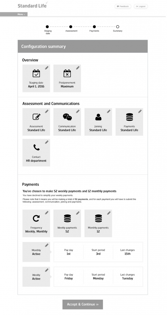
Version 2: Appreciated the more visual page design, but worries it is hard to follow as the tile layouts are the same in the previous page.
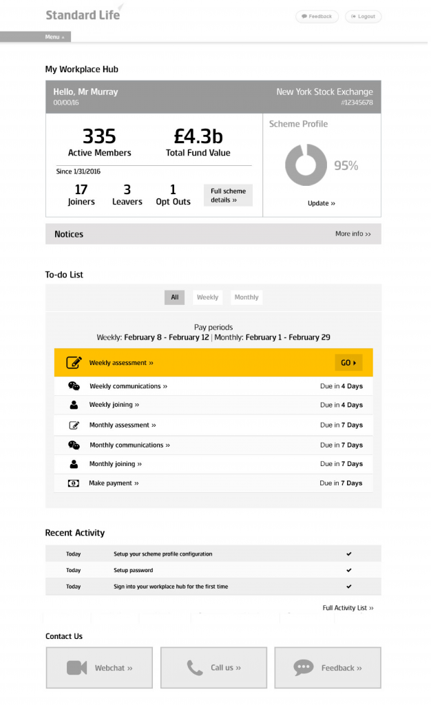
Hub Post Configuration
After user testing, I started to create hi-fi prototypes using Standard Life’s brand. We went through another 3 rounds of user testing and 5 iterations before finalizing on the designs below. Once the designs were approved, the team flushed out all the remaining or missing pages in preparation to be shipped out for the engineers to start production!